# An Image Viewer
Let’s look at a larger example of how Qt Quick Controls are used. For this, we will create a simple image viewer.
First, we create it for desktop using the Fusion style, then we will refactor it for a mobile experience before having a look at the final code base.
# The Desktop Version
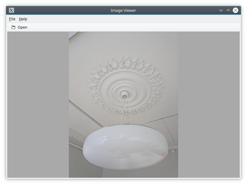
The desktop version is based around a classic application window with a menu bar, a tool bar and a document area. The application can be seen in action below.

We use the Qt Creator project template for an empty Qt Quick application as a starting point. However, we replace the default Window element from the template with a ApplicationWindow from the QtQuick.Controls module. The code below shows main.qml where the window itself is created and setup with a default size and title.
import QtQuick
import QtQuick.Controls
import Qt.labs.platform as Platform

ApplicationWindow {
    visible: true
    width: 640
    height: 480

    // ...

}
The ApplicationWindow consists of four main areas as shown below. The menu bar, tool bar and status bar are usually populated by instances of MenuBar, ToolBar or TabBar controls, while the contents area is where the children of the window go. Notice that the image viewer application does not feature a status bar; that is why it is missing from the code show here, as well as from the figure above.
As we are targeting desktop, we enforce the use of the Fusion style. This can be done via a configuration file, environment variables, command line arguments, or programmatically in the C++ code. We do it the latter way by adding the following line to main.cpp:
QQuickStyle::setStyle("Fusion");
We then start building the user interface in main.qml by adding an Image element as the contents. This element will hold the images when the user opens them, so for now it is just a placeholder. The background property is used to provide an element to the window to place behind the contents. This will be shown when there is no image loaded, and as borders around the image if the aspect ratio does not let it fill the contents area of the window.
ApplicationWindow {

    // ...

    background: Rectangle {
        color: "darkGray"
    }

    Image {
        id: image
        anchors.fill: parent
        fillMode: Image.PreserveAspectFit
        asynchronous: true
    }

    // ...

}
We then continue by adding the ToolBar. This is done using the toolBar property of the window. Inside the tool bar we add a Flow element which will let the contents fill the width of the control before overflowing to a new row. Inside the flow we place a ToolButton.
The ToolButton has a couple of interesting properties. The text is straight forward. However, the icon.name is taken from the freedesktop.org Icon Naming Specification (opens new window). In that document, a list of standard icons are listed by name. By referring to such a name, Qt will pick out the correct icon from the current desktop theme.
In the onClicked signal handler of the ToolButton is the final piece of code. It calls the open method on the fileOpenDialog element.
ApplicationWindow {

    // ...

    header: ToolBar {
        Flow {
            anchors.fill: parent
            ToolButton {
                text: qsTr("Open")
                icon.name: "document-open"
                onClicked: fileOpenDialog.open()
            }
        }
    }

    // ...

}
The fileOpenDialog element is a FileDialog control from the Qt.labs.platform module. The file dialog can be used to open or save files. We import the Qt.labs.platform as Platform, to avoid a naming collision with the QtQuick.Controls import, hence we refer to it as Platform.FileDialog.
In the code we start by assigning a title. Then we set the starting folder using the StandardsPaths class. The StandardsPaths class holds links to common folders such as the user’s home, documents, and so on. After that we set a name filter that controls which files the user can see and pick using the dialog.
Finally, we reach the onAccepted signal handler where the Image element that holds the window contents is set to show the selected file. There is an onRejected signal as well, but we do not need to handle it in the image viewer application.
ApplicationWindow {

    // ...

    FileDialog {
        id: fileOpenDialog
        title: "Select an image file"
        folder: StandardPaths.writableLocation(StandardPaths.DocumentsLocation)
        nameFilters: [
            "Image files (*.png *.jpeg *.jpg)",
        ]
        onAccepted: {
            image.source = fileOpenDialog.fileUrl
        }
    }

    // ...

}
We then continue with the MenuBar. To create a menu, one puts Menu elements inside the menu bar, and then populates each Menu with MenuItem elements.
In the code below, we create two menus, File and Help. Under File, we place Open using the same icon and action as the tool button in the tool bar. Under Help, you find About which triggers a call to the open method of the aboutDialog element.
Notice that the ampersands (“&”) in the title property of the Menu and the text property of the MenuItem turn the following character into a keyboard shortcut; e.g. you reach the file menu by pressing Alt+F, followed by Alt+O to trigger the open item.
ApplicationWindow {

    // ...

    menuBar: MenuBar {
        Menu {
            title: qsTr("&File")
            MenuItem {
                text: qsTr("&Open...")
                icon.name: "document-open"
                onTriggered: fileOpenDialog.open()
            }
        }

        Menu {
            title: qsTr("&Help")
            MenuItem {
                text: qsTr("&About...")
                onTriggered: aboutDialog.open()
            }
        }
    }

    // ...

}
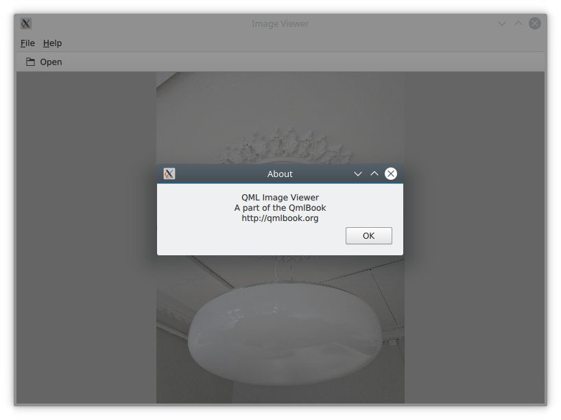
The aboutDialog element is based on the Dialog control from the QtQuick.Controls module, which is the base for custom dialogs. The dialog we are about to create is shown in the figure below.

The code for the aboutDialog can be split into three parts. First, we setup the dialog window with a title. Then, we provide some contents for the dialog – in this case, a Label control. Finally, we opt to use a standard Ok button to close the dialog.
ApplicationWindow {

    // ...

    Dialog {
        id: aboutDialog
        title: qsTr("About")
        Label {
            anchors.fill: parent
            text: qsTr("QML Image Viewer\nA part of the QmlBook\nhttp://qmlbook.org")
            horizontalAlignment: Text.AlignHCenter
        }

        standardButtons: StandardButton.Ok
    }

    // ...

}
The end result of all this is a functional, albeit simple, desktop application for viewing images.
# Moving to Mobile
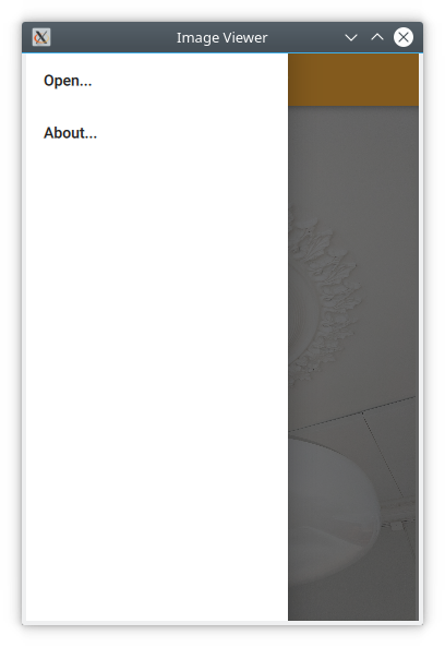
There are a number of differences in how a user interface is expected to look and behave on a mobile device compared to a desktop application. The biggest difference for our application is how the actions are accessed. Instead of a menu bar and a tool bar, we will use a drawer from which the user can pick the actions. The drawer can be swiped in from the side, but we also offer a hamburger button in the header. The resulting application with the drawer open can be seen below.

First of all, we need to change the style that is set in main.cpp from Fusion to Material:
QQuickStyle::setStyle("Material");
Then we start adapting the user interface. We start by replacing the menu with a drawer. In the code below, the Drawer component is added as a child to the ApplicationWindow. Inside the drawer, we put a ListView containing ItemDelegate instances. It also contains a ScrollIndicator used to show which part of a long list is being shown. As our list only consists of two items, the indicator is not visible in this example.
The drawer's ListView is populated from a ListModel where each ListItem corresponds to a menu item. Each time an item is clicked, in the onClicked method, the triggered method of the corresponding ListItem is called. This way, we can use a single delegate to trigger different actions.
ApplicationWindow {

    // ...

    id: window

    Drawer {
        id: drawer

        width: Math.min(window.width, window.height) / 3 * 2
        height: window.height

        ListView {
            focus: true
            currentIndex: -1
            anchors.fill: parent

            delegate: ItemDelegate {
                width: parent.width
                text: model.text
                highlighted: ListView.isCurrentItem
                onClicked: {
                    drawer.close()
                    model.triggered()
                }
            }

            model: ListModel {
                ListElement {
                    text: qsTr("Open...")
                    triggered: function() { fileOpenDialog.open(); }
                }
                ListElement {
                    text: qsTr("About...")
                    triggered: function() { aboutDialog.open(); }
                }
            }

            ScrollIndicator.vertical: ScrollIndicator { }
        }
    }

    // ...

}
The next change is in the header of the ApplicationWindow. Instead of a desktop style toolbar, we add a button to open the drawer and a label for the title of our application.

The ToolBar contains two child elements: a ToolButton and a Label.
The ToolButton control opens the drawer. The corresponding close call can be found in the ListView delegate. When an item has been selected, the drawer is closed. The icon used for the ToolButton comes from the Material Design Icons page (opens new window).
ApplicationWindow {

    // ...

    header: ToolBar {
        ToolButton {
            id: menuButton
            anchors.left: parent.left
            anchors.verticalCenter: parent.verticalCenter
            icon.source: "images/baseline-menu-24px.svg"
            onClicked: drawer.open()
        }
        Label {
            anchors.centerIn: parent
            text: "Image Viewer"
            font.pixelSize: 20
            elide: Label.ElideRight
        }
    }

    // ...

}
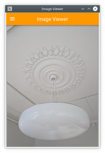
Finally we make the background of the toolbar pretty — or at least orange. To do this, we alter the Material.background attached property. This comes from the QtQuick.Controls.Material module and only affects the Material style.
import QtQuick.Controls.Material

ApplicationWindow {

    // ...

    header: ToolBar {
        Material.background: Material.Orange

    // ...

}
With these few changes we have converted our desktop image viewer to a mobile-friendly version.
# A Shared Codebase
In the past two sections we have looked at an image viewer developed for desktop use and then adapted it to mobile.
Looking at the code base, much of the code is still shared. The parts that are shared are mostly associated with the document of the application, i.e. the image. The changes have accounted for the different interaction patterns of desktop and mobile, respectively. Naturally, we would want to unify these code bases. QML supports this through the use of file selectors.
A file selector lets us replace individual files based on which selectors are active. The Qt documentation maintains a list of selectors in the documentation for the QFileSelector class (link (opens new window)). In our case, we will make the desktop version the default and replace selected files when the android selector is encountered. During development you can set the environment variable QT_FILE_SELECTORS to android to simulate this.
File Selector
File selectors work by replacing files with an alternative when a selector is present.
By creating a directory named +selector (where selector represents the name of a selector) in the same directory as the files that you want to replace, you can then place files with the same name as the file you want to replace inside the directory. When the selector is present, the file in the directory will be picked instead of the original file.
The selectors are based on the platform: e.g. android, ios, osx, linux, qnx, and so on. They can also include the name of the Linux distribution used (if identified), e.g. debian, ubuntu, fedora. Finally, they also include the locale, e.g. en_US, sv_SE, etc.
It is also possible to add your own custom selectors.
The first step to do this change is to isolate the shared code. We do this by creating the ImageViewerWindow element which will be used instead of the ApplicationWindow for both of our variants. This will consist of the dialogs, the Image element and the background. In order to make the open methods of the dialogs available to the platform specific code, we need to expose them through the functions openFileDialog and openAboutDialog.
import QtQuick
import QtQuick.Controls
import Qt.labs.platform as Platform

ApplicationWindow {
    function openFileDialog() { fileOpenDialog.open(); }
    function openAboutDialog() { aboutDialog.open(); }

    visible: true
    title: qsTr("Image Viewer")

    background: Rectangle {
        color: "darkGray"
    }

    Image {
        id: image
        anchors.fill: parent
        fillMode: Image.PreserveAspectFit
        asynchronous: true
    }

    Platform.FileDialog {
        id: fileOpenDialog

        // ...

    }

    Dialog {
        id: aboutDialog

        // ...

    }
}
Next, we create a new main.qml for our default style Fusion, i.e. the desktop version of the user interface.
Here, we base the user interface around the ImageViewerWindow instead of the ApplicationWindow. Then we add the platform specific parts to it, e.g. the MenuBar and ToolBar. The only changes to these is that the calls to open the respective dialogs are made to the new functions instead of directly to the dialog controls.
import QtQuick
import QtQuick.Controls

ImageViewerWindow {
    id: window

    width: 640
    height: 480

    menuBar: MenuBar {
        Menu {
            title: qsTr("&File")
            MenuItem {
                text: qsTr("&Open...")
                icon.name: "document-open"
                onTriggered: window.openFileDialog()
            }
        }

        Menu {
            title: qsTr("&Help")
            MenuItem {
                text: qsTr("&About...")
                onTriggered: window.openAboutDialog()
            }
        }
    }

    header: ToolBar {
        Flow {
            anchors.fill: parent
            ToolButton {
                text: qsTr("Open")
                icon.name: "document-open"
                onClicked: window.openFileDialog()
            }
        }
    }
}
Next, we have to create a mobile specific main.qml. This will be based around the Material theme. Here, we keep the Drawer and the mobile-specific toolbar. Again, the only change is how the dialogs are opened.
import QtQuick
import QtQuick.Controls
import QtQuick.Controls.Material

ImageViewerWindow {
    id: window

    width: 360
    height: 520

    Drawer {
        id: drawer

        // ...

        ListView {

            // ...

            model: ListModel {
                ListElement {
                    text: qsTr("Open...")
                    triggered: function(){ window.openFileDialog(); }
                }
                ListElement {
                    text: qsTr("About...")
                    triggered: function(){ window.openAboutDialog(); }
                }
            }

            // ...

        }
    }

    header: ToolBar {

        // ...

    }
}
The two main.qml files are placed in the file system as shown below. This lets the file selector that the QML engine automatically creates pick the right file. By default, the Fusion main.qml is loaded. If the android selector is present, then the Material main.qml is loaded instead.
Until now the style has been set in main.cpp. We could continue doing this and use #ifdef expressions to set different styles for different platforms. Instead we will use the file selector mechanism again and set the style using a configuration file. Below, you can see the file for the Material style, but the Fusion file is equally simple.
[Controls]
Style=Material
These changes have given us a joined codebase where all the document code is shared and only the differences in user interaction patterns differ. There are different ways to do this, e.g. keeping the document in a specific component that is included in the platform specific interfaces, or as in this example, by creating a common base that is extended by each platform. The best approach is best determined when you know how your specific code base looks and can decide how to separate the common from the unique.
# Native Dialogs
When using the image viewer you will notice that it uses a non-standard file selector dialog. This makes it look out of place.
The Qt.labs.platform module can help us solve this. It provides QML bindings to native dialogs such as the file dialog, font dialog and colour dialog. It also provides APIs to create system tray icons, as well as system global menus that sits on top of the screen (e.g. as in OS X). The cost of this is a dependency on the QtWidgets module, as the widget based dialog is used as a fallback where the native support is missing.
In order to integrate a native file dialog into the image viewer, we need to import the Qt.labs.platform module. As this module has name clashes with the QtQuick.Dialogs module which it replaces, it is important to remove the old import statement.
In the actual file dialog element, we have to change how the folder property is set, and ensure that the onAccepted handler uses the file property instead of the fileUrl property. Apart from these details, the usage is identical to the FileDialog from QtQuick.Dialogs.
import QtQuick
import QtQuick.Controls
import Qt.labs.platform as Platform

ApplicationWindow {

    // ...

    Platform.FileDialog {
        id: fileOpenDialog
        title: "Select an image file"
        folder: StandardPaths.writableLocation(StandardPaths.DocumentsLocation)
        nameFilters: [
            "Image files (*.png *.jpeg *.jpg)",
        ]
        onAccepted: {
            image.source = fileOpenDialog.file
        }
    }

    // ...

}
In addition to the QML changes, we also need to alter the project file of the image viewer to include the widgets module.
QT += quick quickcontrols2 widgets
And we need to update main.qml to instantiate a QApplication object instead of a QGuiApplication object. This is because the QGuiApplication class contains the minimal environment needed for a graphical application, while QApplication extends QGuiApplication with features needed to support QtWidgets.
include <QApplication>

// ...

int main(int argc, char *argv[])
{
    QApplication app(argc, argv);

    // ...

}
With these changes, the image viewer will now use native dialogs on most platforms. The platforms supported are iOS, Linux (with a GTK+ platform theme), macOS, Windows and WinRT. For Android, it will use a default Qt dialog provided by the QtWidgets module.