# Introduction to Controls
Using Qt Quick from scratch gives you primitive graphical and interaction elements from which you can build your user interfaces. Using Qt Quick Controls you start from a slightly more structured set of controls to build from.
The controls range from simple text labels and buttons to more complex ones such as sliders and dials. These elements are handy if you want to create a user interface based on classic interaction patterns, as they provide a good foundation to stand on.
Qt Quick Controls come with a number of styles out of the box that are shown in the table below. The Basic style is a basic flat style. The Universal style is based on the Microsoft Universal Design Guidelines, while Material is based on Google’s Material Design Guidelines, and the Fusion style is a desktop-oriented style.
Some of the styles can be tweaked by modifying palettes. The Imagine style is based on image assets, this allows a graphical designer to create a new style without writing any code at all, not even for palette colour codes.
Basic
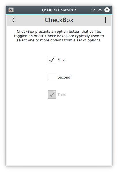
Fusion
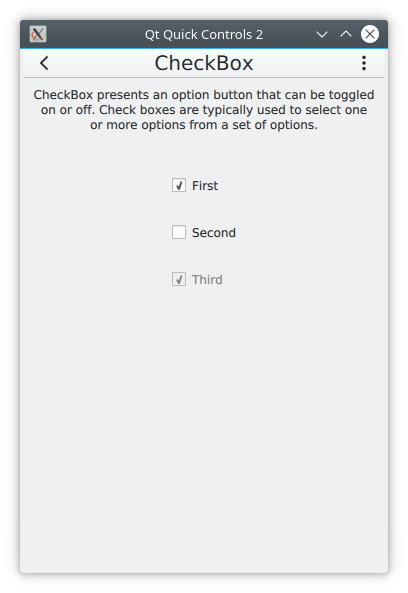
macOS
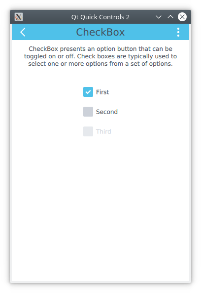
Material
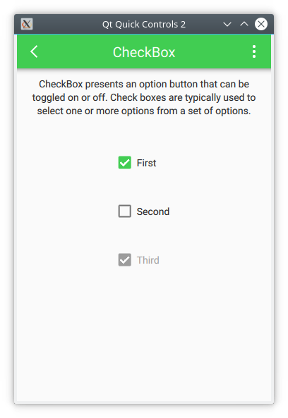
Imagine

Windows

Universal
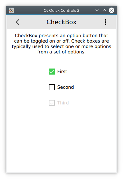
Qt Quick Controls 2 is available from the QtQuick.Controls import. The following modules are also of interest:
QtQuick.Controls- The basic controls.QtQuick.Templates- Provides the behavioral, non-visual base types for the controls.QtQuick.Controls.Imagine- Imagine style theming support.QtQuick.Controls.Material- Material style theming support.QtQuick.Controls.Universal- Universal style theming support.Qt.labs.platform- Support for platform native dialogs for common tasks such as picking files, colours, etc, as well as system tray icons and standard paths.
Qt.Labs
Notice that the Qt.labs modules are experimental, meaning that their APIs can have breaking changes between Qt versions.