# States and Transitions
Often parts of a user interface can be described in states. A state defines a set of property changes and can be triggered by a certain condition.
Additionally, these state switches can have a transition attached which defines how these changes should be animated or any additional actions that shall be applied. Actions can also be applied when a state is entered.
# States
You define states in QML with the State element, which needs to be bound to the states array of any item element.
A state is identified through a state name, and in its simplest form, consists of a series of property changes on elements. The default state is defined by the initial properties of the element and is named "" (an empty string).
Item {
    id: root
    states: [
        State {
            name: "go"
            PropertyChanges { ... }
        },
        State {
            name: "stop"
            PropertyChanges { ... }
        }
    ]
}
A state is changed by assigning a new state name to the state property of the element in which the states are defined.
Control states using when
Another way to control states is using the when property of the State element. The when property can be set to an expression that evaluates to true when the state should be applied.
Item {
    id: root
    states: [
        ...
    ]

    Button {
        id: goButton
        ...
        onClicked: root.state = "go"
    }
}
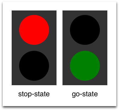
For example, a traffic light might have two signaling lights. The upper one signaling stop with a red color and the lower one signaling go with a green color. In this example, both lights should not shine at the same time. Let’s have a look at the state chart diagram.
When the system is switched on, it automatically goes into the stop mode as the default state. The stop state changes light1 to red and light2 to black (off).
An external event can now trigger a state switch to the "go" state. In the go state, we change the color properties from light1 to black (off) and light2 to green to indicate the pedestrians may now cross.
To realize this scenario we start sketching our user interface for the 2 lights. For simplicity, we use 2 rectangles with the radius set to the half of the width (and the width is the same as the height, which means it’s a square).
Rectangle {
    id: light1
    x: 25; y: 15
    width: 100; height: width
    radius: width / 2
    color: root.black
    border.color: Qt.lighter(color, 1.1)
}

Rectangle {
    id: light2
    x: 25; y: 135
    width: 100; height: width
    radius: width/2
    color: root.black
    border.color: Qt.lighter(color, 1.1)
}
As defined in the state chart we want to have two states: one being the "go" state and the other the "stop" state, where each of them changes the traffic light's respective color to red or green. We set the state property to stop to ensure the initial state of our traffic light is the stop state.
Initial state
We could have achieved the same effect with only a "go" state and no explicit "stop" state by setting the color of light1 to red and the color of light2 to black. The initial state "" defined by the initial property values would then act as the "stop" state.
state: "stop"

states: [
    State {
        name: "stop"
        PropertyChanges { target: light1; color: root.red }
        PropertyChanges { target: light2; color: root.black }
    },
    State {
        name: "go"
        PropertyChanges { target: light1; color: root.black }
        PropertyChanges { target: light2; color: root.green }
    }
]
Using PropertyChanges { target: light2; color: "black" } is not really required in these examples as the initial color of light2 is already black. In a state, it’s only necessary to describe how the properties shall change from their default state (and not from the previous state).
A state change is triggered using a mouse area which covers the whole traffic light and toggles between the go- and stop-state when clicked.
MouseArea {
    anchors.fill: parent
    onClicked: parent.state = (parent.state == "stop" ? "go" : "stop")
}
We are now able to successfully change the state of the traffic lamp. To make the UI more appealing and natural, we should add some transitions with animation effects. A transition can be triggered by a state change.
Using scripting
It’s possible to create similar logic using scripting instead of QML states. However, QML is a better language than JavaScript for describing user interfaces. Where possible, aim to write declarative code instead of imperative code.
# Transitions
A series of transitions can be added to every item. A transition is executed by a state change.
You can define on which state change a particular transition can be applied using the from: and to: properties. These two properties act like a filter: when the filter is true the transition will be applied. You can also use the wildcard “*”, which means “any state”.
For example, from: "*"; to: "*" means "from any state to any other state", and is the default value for from and to. This means the transition will be applied to every state switch.
For this example, we would like to animate the color changes when switching state from “go” to “stop”. For the other reversed state change (“stop” to “go”) we want to keep an immediate color change and don’t apply a transition.
We restrict the transition with the from and to properties to filter only the state change from “go” to “stop”. Inside the transition, we add two color animations for each light, which shall animate the property changes defined in the state description.
transitions: [
    Transition {
        from: "stop"; to: "go"
        // from: "*"; to: "*"
        ColorAnimation { target: light1; properties: "color"; duration: 2000 }
        ColorAnimation { target: light2; properties: "color"; duration: 2000 }
    }
]
You can change the state though clicking the UI. The state is applied immediately and will also change the state while a transition is running. So, try to click the UI while the state is in the transition from “stop” to “go”. You will see the change will happen immediately.

You could play around with this UI by, for example, scaling the inactive light down to highlight the active light.
For this, you would need to add another property change for scaling to the states and also handle the animation for the scaling property in the transition.
Another option would be to add an “attention” state where the lights are blinking yellow. For this, you would need to add a sequential animation to the transition for one second going to yellow (“to” property of the animation and one second going to “black”).
Maybe you would also want to change the easing curve to make it more visually appealing.