# Loading Components Dynamically
The easiest way to dynamically load different parts of QML is to use the Loader element. It serves as a placeholder to the item that is being loaded. The item to load is controlled through either the source property or the sourceComponent property. The former loads the item from a given URL, while the latter instantiates a Component.
As the loader serves as a placeholder for the item being loaded, its size depends on the size of the item, and vice versa. If the Loader element has a size, either by having set width and height or through anchoring, the loaded item will be given the loader’s size. If the Loader has no size, it is resized in accordance to the size of the item being loaded.
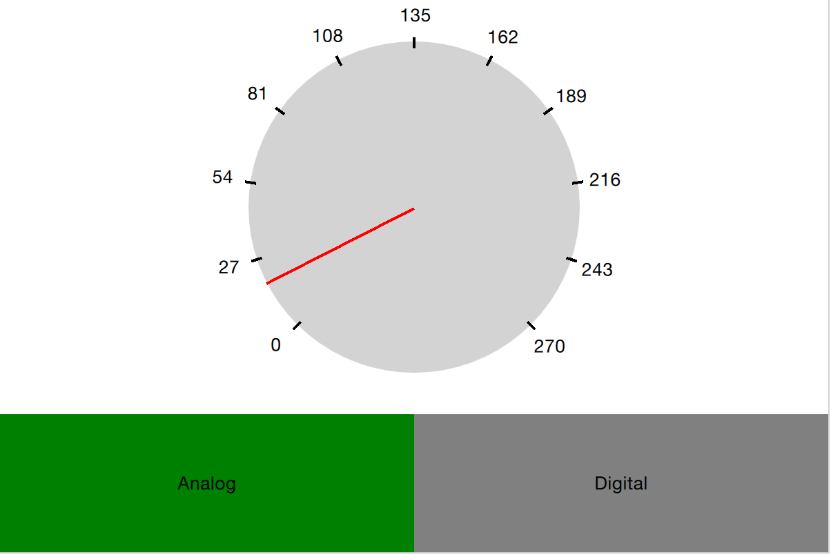
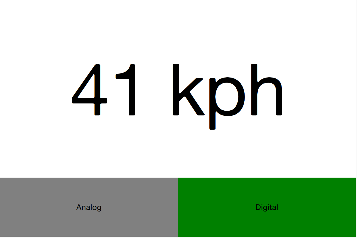
The example described below demonstrates how two separate user interface parts can be loaded into the same space using a Loader element. The idea is to have a speed dial that can be either digital or analog, as shown in the illustration below. The code surrounding the dial is unaffected by which item that is loaded for the moment.


The first step in the application is to declare a Loader element. Notice that the source property is left out. This is because the source depends on which state the user interface is in.
Loader {
    id: dialLoader

    anchors.fill: parent
}
In the states property of the parent of dialLoader a set of PropertyChanges elements drives the loading of different QML files depending on the state. The source property happens to be a relative file path in this example, but it can just as well be a full URL, fetching the item over the web.
states: [
    State {
        name: "analog"
        PropertyChanges { target: analogButton; color: "green"; }
        PropertyChanges { target: dialLoader; source: "Analog.qml"; }
    },
    State {
        name: "digital"
        PropertyChanges { target: digitalButton; color: "green"; }
        PropertyChanges { target: dialLoader; source: "Digital.qml"; }
    }
]
In order to make the loaded item come alive, it is speed property must be bound to the root speed property. This cannot be done as a direct binding as the item not always is loaded and changes over time. Instead, a Binding element must be used. The target property of the binding is changed every time the Loader triggers the onLoaded signal.
Loader {
    id: dialLoader

    anchors.left: parent.left
    anchors.right: parent.right
    anchors.top: parent.top
    anchors.bottom: analogButton.top

    onLoaded: {
        binder.target = dialLoader.item;
    }
}

Binding {
    id: binder

    property: "speed"
    value: root.speed
}
The onLoaded signal lets the loading QML act when the item has been loaded. In a similar fashion, the QML being loaded can rely on the Component.onCompleted signal. This signal is actually available for all components, regardless of how they are loaded. For instance, the root component of an entire application can use it to kick-start itself when the entire user interface has been loaded.
# Connecting Indirectly
When creating QML elements dynamically, you cannot connect to signals using the onSignalName approach used for static setup. Instead, the Connections element must be used. It connects to any number of signals of a target element.
Having set the target property of a Connections element, the signals can be connected, as usual, that is, using the onSignalName approach. However, by altering the target property, different elements can be monitored at different times.

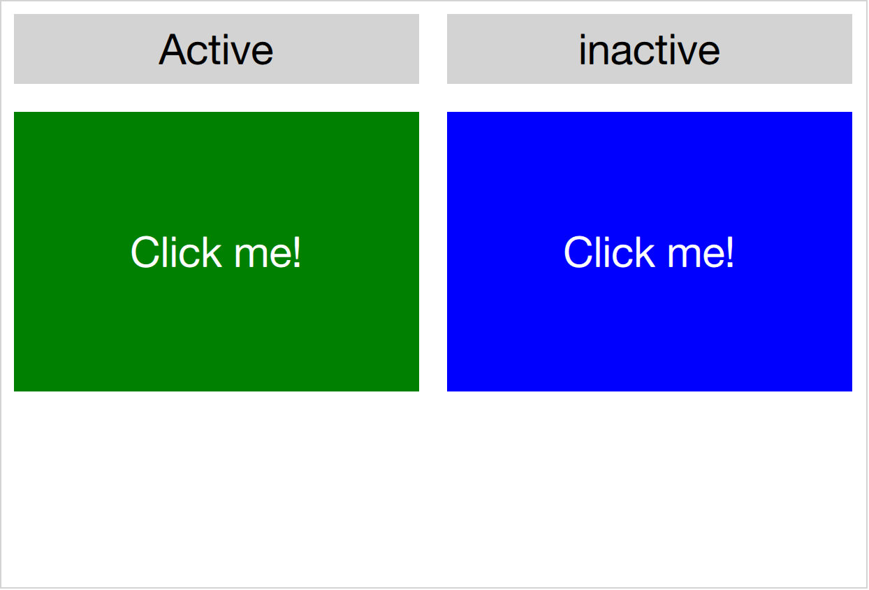
In the example shown above, a user interface consisting of two clickable areas is presented to the user. When either area is clicked, it is flashed using an animation. The left area is shown in the code snippet below. In the MouseArea, the leftClickedAnimation is triggered, causing the area to flash.
Rectangle {
    id: leftRectangle

    width: 290
    height: 200

    color: "green"

    MouseArea {
        id: leftMouseArea
        anchors.fill: parent
        onClicked: leftClickedAnimation.start()
    }

    Text {
        anchors.centerIn: parent
        font.pixelSize: 30
        color: "white"
        text: "Click me!"
    }
}
In addition to the two clickable areas, a Connections element is used. This triggers the third animation when the active, i.e. the target of the element, is clicked.
Connections {
    id: connections
    function onClicked() { activeClickedAnimation.start() }
}
To determine which MouseArea to target, two states are defined. Notice that we cannot set the target property using a PropertyChanges element, as it already contains a target property. Instead a StateChangeScript is utilized.
states: [
    State {
        name: "left"
        StateChangeScript {
            script: connections.target = leftMouseArea
        }
    },
    State {
        name: "right"
        StateChangeScript {
            script: connections.target = rightMouseArea
        }
    }
]
When trying out the example, it is worth noticing that when multiple signal handlers are used, all are invoked. The execution order of these is, however, undefined.
When creating a Connections element without setting the target property, the property defaults to parent. This means that it has to be explicitly set to null to avoid catching signals from the parent until the target is set. This behavior does make it possible to create custom signal handler components based on a Connections element. This way, the code reacting to the signals can be encapsulated and re-used.
In the example below, the Flasher component can be put inside any MouseArea. When clicked, it triggers an animation, causing the parent to flash. In the same MouseArea the actual task being triggered can also be carried out. This separates the standardized user feedback, i.e. the flashing, from the actual action.
import QtQuick

Connections {
	function onClicked() {
		// Automatically targets the parent
	}
}
To use the Flasher, simply instantiate a Flasher within each MouseArea, and it all works.
import QtQuick

Item {
	// A background flasher that flashes the background of any parent MouseArea
}
When using a Connections element to monitor the signals of multiple types of target elements, you sometimes find yourself in a situation where the available signals vary between the targets. This results in the Connections element outputting run-time errors as signals are missed. To avoid this, the ignoreUnknownSignal property can be set to true. This ignores all such errors.
TIP
It is usually a bad idea to suppress error messages, and if you do, make sure to document why in a comment.
# Binding Indirectly
Just as it is not possible to connect to signals of dynamically created elements directly, nor it is possible to bind properties of a dynamically created element without working with a bridge element. To bind a property of any element, including dynamically created elements, the Binding element is used.
The Binding element lets you specify a target element, a property to bind and a value to bind it to. Through using a Binding element, it is, for instance, possible to bind properties of a dynamically loaded element. This was demonstrated in the introductory example in this chapter, as shown below.
Loader {
    id: dialLoader

    anchors.left: parent.left
    anchors.right: parent.right
    anchors.top: parent.top
    anchors.bottom: analogButton.top

    onLoaded: {
        binder.target = dialLoader.item;
    }
}

Binding {
    id: binder

    property: "speed"
    value: root.speed
}
As the target element of a Binding not always is set, and perhaps not always has a given property, the when property of the Binding element can be used to limit the time when the binding is active. For instance, it can be limited to specific modes in the user interface.
The Binding element also comes with a delayed property. When this property is set to true the binding is not propagated to the target until the event queue has been emptied. In high load situations this can serve as an optimization as intermediate values are not pushed to the target.